Looking at the Little Things
I am being fairly literal with my observations below. Photography is personal and abstracting images as you visualize them, is something that everyone has the right to do. I enjoyed showing surreal viewpoints as much as anyone with a camera.
I published a post a while back where I showed a series of images, first in full color, and then in black & white. It is the obvious way to truly discern whether any given image works better one way or the other, or equally well.
I have repeated that formula below, only in this case, the full-color image barely has any noticeable color to begin with.
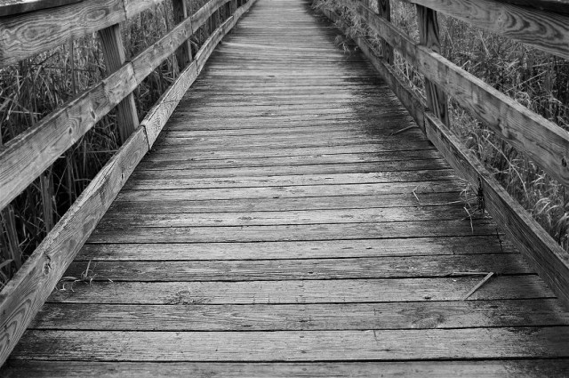
The warm colored Cattails peeking through the edges of the bridge at first seem to be the only color in this picture. If you look closely at the grayish boards and railings, you will see that there is indeed a subtle cast of color mixed in with the monochrome.
The second image is in pure black & white, and as you would expect works nicely.
I actually prefer the color shot. The contrast between the color of the plants on the edge of the scene, and “almost” black & white bridge, jar my senses just enough to make the photo interesting.
As a compositional aside, while I like this old picture it would be more powerful if the scene did not end so abruptly. I should have backed up, and used a longer lens to compress a more distant part of the bridge with the entrance.
There were not a lot of compositional choices to make with this mare and foal, at high noon in Monument Valley. I jumped out of the car, set up and grabbed what I could, while I could. I found the scene sort of “semi” iconic, although working at noon was an issue.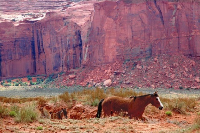
I am not now or I ever have been a software editing wizard, but I did add a little exposure to the horses and take a little away from the background. Originally the horses were sort of a black hole.
Flowers with dew or rain are a favorite of some photographers. I count myself as one. This shot of Asters was just what I was looking for on a mid morning shoot. I managed to isolate two blossoms against a shaded background. I like my composition here but I could have, via the cloning tool, eliminated that tiny bit of another blossom showing in the upper right hand corner. I have always opted to share this image as is.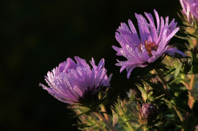
The background on this dewy Lily was turned to black by me using the Magic Wand tool in Photoshop to highlight all of the background area, and then reducing the light until it was pure black. It is a manipulated image.
I actually am tolerant but not enthusiastic about this composition. I would like it far, far better if the entire blossom was composed off to the left of center, instead of right. The flower was photographed with my position slightly left of center. That creates an energy in the picture that is headed to the right of center in the direction the Lily is “looking”. The open space should be in that area where the flower is….looking. Otherwise, I like this clear and pretty picture.
I’ve shown this old film image before. I really did find this fall leaf with the feather already on it. I did move the feather slightly to make a better comp. That said, I love the subjects, and the contrast between them, and the detail, but not so crazy about the picture otherwise. I will let you in on a secret, I am not sure whether this photo was shot in the vertical or horizontal formats. I actually found this digital copy in my files in the horizontal format, and flipped it this way. It just seems to make more sense that way. In my opinion, while I love close-up work that reveals only part of a subject, I should have backed off and included the entire leaf and feather. For one thing, this picture belies the truth about the tiny size of the leaf and feather. Of course, resting in my film files may well be that picture. My memory is very vague about the creation of this image.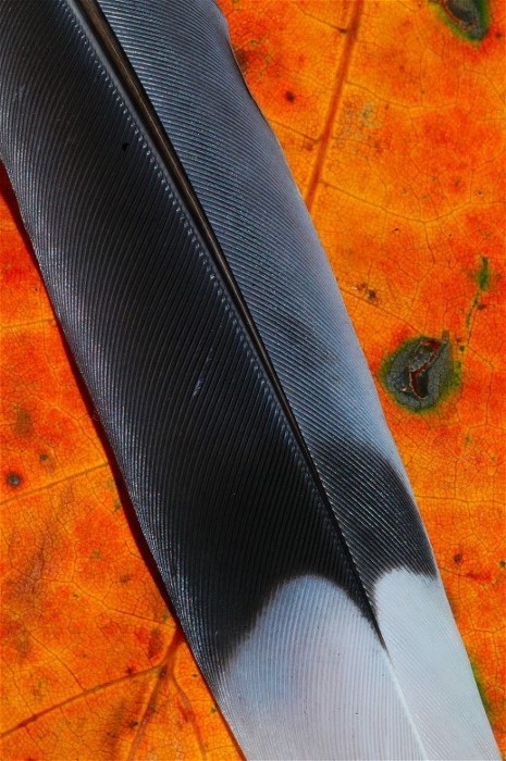
There is a place in the world of photography for journalistic images that tell, or show a story, without worrying about artistry.
This image was made on film in the Smoky Mts. Many years ago. These varied Swallowtail Butterflies are practicing mudding behavior, and this is a respectable natural history photo. Do I feel that I could have done much better? Always!
One of my favorite scenic locations in any wildlife refuge that I have visited, is this slow part of the Mingo River in Mingo NWR in Missouri. I have shown this image, with its outrageous green, before.
My composition here is pretty compelling but I only wish I would have made one small adjustment.
My aim was to spread out the Cypress trees as much as the logistics of the place allowed. If I could have moved a little to the left, and separated the closest tree from the partial tree you see in back of it, the image would have been better. That however, would have required swimming. With that said, I could have easily moved to the right and made the partial tree disappear behind the other tree, altogether.
I do look at most images that closely, but I am only hard on my own work.
Horizon lines are important in landscape and waterscape photography, but especially waterscape.
If you are making a landscape in a prairie or desert that is clearly flat, you need your horizon level. In many if not most landscapes, the land is not level to begin with. Mountains are obvious, but even a field next to your home may slant one way or the other.
Water, rests up and down in order to follow the earth, under water. At the top, it all levels off. Of course waves, especially rolling waves can cause some fluctuation at the horizon, especially if you are only shooting a narrow section. Otherwise, horizons are level with water.
I have bubble levels on several tripods just to aid me in keeping the water level.
The horizon is not level in this image, although it is not as slanted as it looks at first blush. The clouds are increasing as we look to our right. The reflection of those clouds is of course increasing the other (mirror) direction in the water. The entrance for water between the land forms is uneven. All of that adds to the problem.
I actually tilted this picture in Photoshop. I then cropped out the white areas that contained no part of the image. After that, the water’s horizon is still uneven. Does it bother you? It does me! In my defense, I do have version of this sunrise with a level horizon.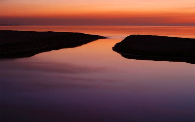
Now this old 19th Century workshop is a perfect candidate for the black & white treatment. If memory serves, I photographed this shop in every way from grand to macro. I like this picture the best. I off centered the windows, which made the image far more interesting than a symmetrical comp would have. You can see some texture on the boards, and you can see some objects on the work bench inside.
I often forget I have this photo as it is not at all spectacular. It was however done right, with attention to detail.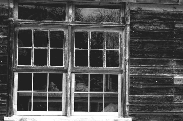
It’s the little things that count.
Wayne
“It’s the little details that are vital. Little things make big things happen.”
John Wooden
