Photography only exists because of contrast.
Photographer X makes a photo. That photo contains no contrast. There
are zero variables of light and dark. It has the exact same tone
throughout. It is also one color. There is zero color contrast
anywhere within the picture frame.
The result of this is, there in essence is no photo. With no variables, there is
no way to see any subject of any sort. There becomes no photo.
Did it ever exist?
Look across the room you are in right now and ask yourself, what do I
see? Why is it (without touch) you can detect and see the pencil on
the table. Your cell phone next to the pencil. The text on the piece
of paper. It is all about contrasting tones and/or colors.
Unlike that table, a photograph is only two dimensional. It is flat.
It depends on contrast for its very existence. Those contrasts create
a “resemblance” of what dimension is. The more contrast the more
dimensional an image often “appears” to be.
I write about contrast constantly on these pages. I do so because
while it is only one facet of a photograph, it is so important that it
can define a photograph. Contrast “describes” where the edges of the
subjects inside the picture are. It breathes life, not only to the
people, animals, plants and other living depictions in the photo, but
to the inanimate objects as well.
Given what I have said above, then the single most important thing in
a photograph, must be its contrast.
That does not mean that all images need be high contrast.
Low contrast images provide us with a wonderful, be it oft times
somber mood. That said, they still exist because of the limited
contrast they contain. Low contrast, is still contrast.
Knowing that without contrast there is no picture, and we know we have
a picture, deciding what kind of contrast it is, will help know what
to pursue, and how to use what we have learned in our photographic
future.
So, there is contrast of tones. Light against dark or vice versa.
Sunlight against shadows would be an example. There are color
contrasts. Warm colors against cool ones provide separation
(contrast). The differences between any two (or more) colors produce
color contrast.
Once we have tone and/or color contrasts, we can still find another
way to create contrast, and therefore produce “perceived”
dimensionality. Depth of field contrast. I tend to refer to this as
“focus contrast”.
By placing a subject that is sharp and in focus (bird, flower, person,
so on), against a subject (background etc.) that is soft and out of
focus, we once again create depth within the frames of a photograph
that actually has no depth at all.
One of our most important jobs as a photographer, is to bring an image
into existence, by exploiting one form of contrast or another.
High contrast or low, tonal contrast, color contrast, or focus
contrast, will tell the viewers of your photos what you meant when you
created any given photo.
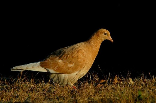
The first two images you see below, provide examples of light (or
tonal) contrasts, as well some color contrast.
Both the observatory and the dove images show us some jarring contrast of tone.
This observatory is bathed in the first rays of sun for the day. The
background consists of an ominous storm. The pop created by the
difference in light is great, although the dimensional contrast is
minor, as the storm provides very little color to contrast with the
warm sunrise colors that are bathing this white building.
It is contrast that makes this a picture that we can see. It is high
contrast that makes the image “pop”.

This dove is colored greatly by the setting sun. The background was
quite dark when I made this image, but admittedly, I reduced what was
left of the light in the editing process
 .
.
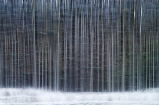
There is just enough tonal contrast in this waterfall image to allow a
separation (dimensionality) of the white falling water and the dark
background. The light was even, but with just enough contrast (white
water and dark background) to give some dimension to the image.
The patterns in this photo are given their dimension by the radical
differences in sun and shadow. This is contrasting light at its best.

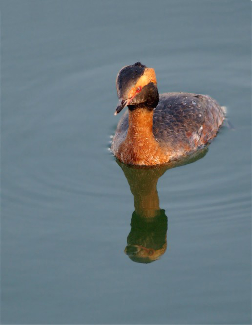
This Horned Grebe’s photo’s dimension, arises partially from its
abrupt and splashy color. There is color contrast here between the
bird’s warm colors with changing tones and the water’s cool, even
tones. Also, the living and animate object as is the bird, does
contrast with the calm and inanimate ”appearing” water.
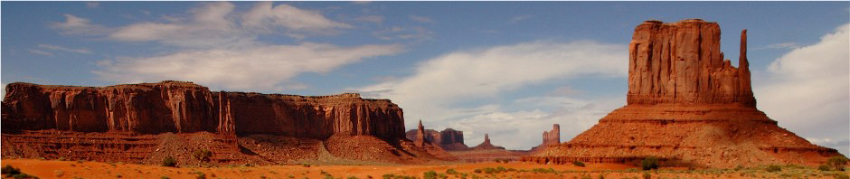
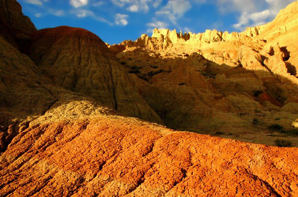
There are beautiful and obvious contrasts of both color and tone in
this image of the Badlands of South Dakota.
The warm rock advances as the cool blue sky recedes…….creating
dimension. There is also a contrast of light between the shadow area
and the highlights.
I can absolutely assure you that I was aware of and was exploiting
contrast when I made this image.
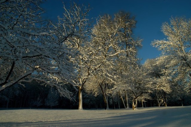
The seasons, especially winter and fall, bring with them great
opportunities to use both contrast and lack of, to promote mood.
High contrast light can be your friend in winter. The earlier or later
on a sunny day you photograph in winter, the higher your opportunity
is to create high mood pictures. This old picture was made with an
18mm lens. The “leaning tree” parallax view that lens choice left me
with, helped add to the drama that the light contrast provided for me.
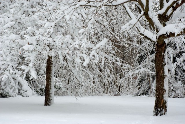
All in all, I love the flat winter light that comes right before,
during or after a storm. The only contrast here are between the white
snow and the dark tree trunks/limbs. That is just enough to put some
depth in the picture while maintaining the quiet, gentle feel just
after a storm.
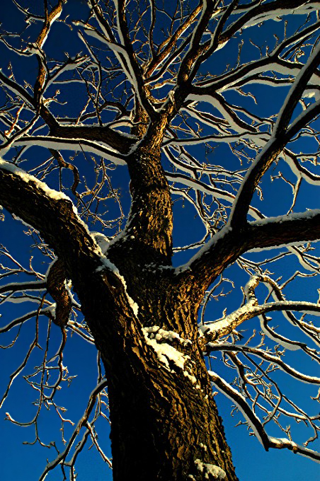
Remember, using contrast means making use of both high and lowlight days.
This sunny day image certainly has contrasts, of light and dark, and
also color. Still, it is likely the contrast created from composing
the image with the tree running away from the camera, that implies
some dimension here. Composition can itself create some contrasting
factors in a picture.
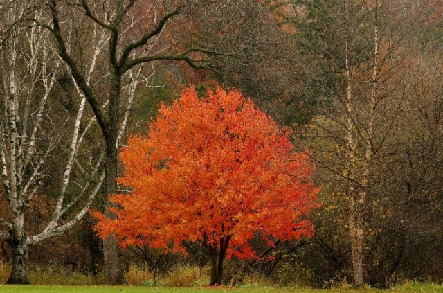
Autumn, including late autumn, is a wonderful season for low contrast
photography.
There are some color contrasts that are in place here. That advancing
red tree does pop out from its mostly leafless surroundings. The
leaves themselves are a contrast with the areas with no leaves. When
we look at this tree, which is refusing to move into winter, it is a
dichotomy or a contrast with everything around it.
Dear Lord I loved autumn as a photographer.
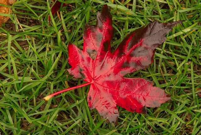
This Maple leaf on grass picture was created on a high bright day. No
direct sun, but quite a bit of brightness penetrating through the
clouds.
This picture is about color contrast. The red is warm and advancing,
and the green is “coolish” and retreating. Red is always warm, but
green is a mix of yellow (warm) and blue (cool). Most greens are
cooler than they are warm, as is the case here, but some greens have
way more yellow than blue, and are on the warmer side. There is some
apparent depth in this flat on the ground picture, due to that color
contrast..
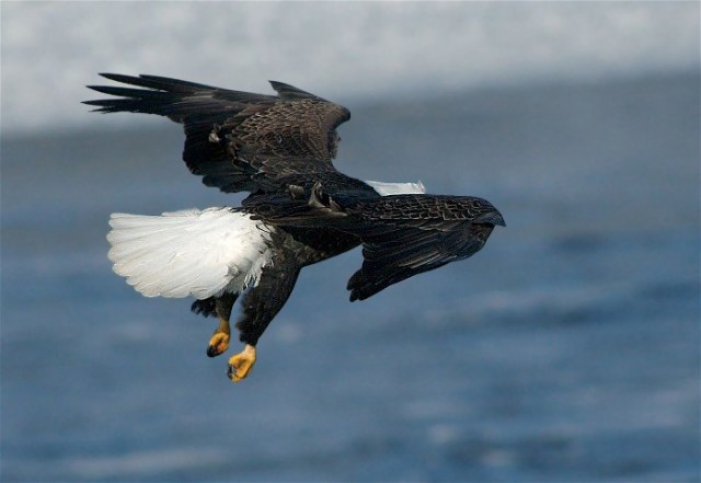
How much or how little depth of field you show in any picture, has a
relationship to contrast and dimensionality.
Obviously, I was forced to use moderately shallow depth if field (f8
with a 500mm lens), in a effort to capture this Bald Eagle in flight
on a cloudy day.
This picture has plenty of contrast despite the flat light, because
the bird is sharp and in focus while the background is soft and
blurry. That separates the bird from its surroundings and makes it
pop. It adds a type of contrast and dimension I call focus contrast.
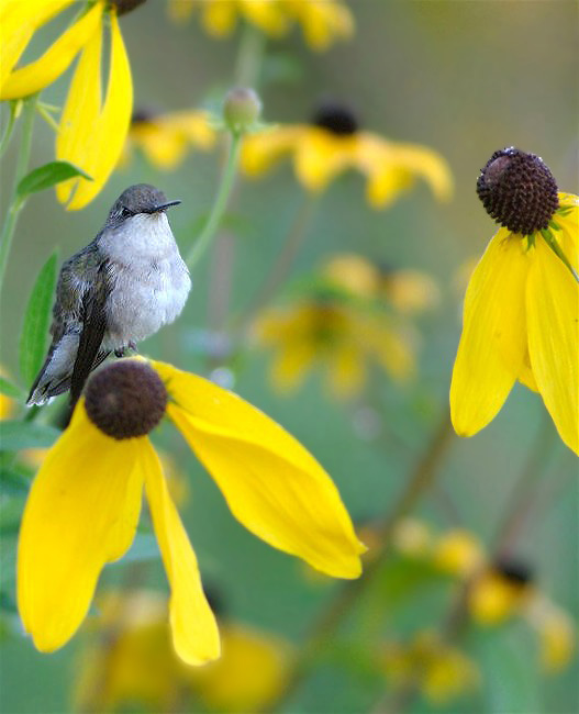
This hummingbird is in much, much busier surroundings than the eagle.
Still, it is the only sharp and in focus subject in the entire
picture. This picture would be more compelling if the coneflower the
hummingbird is sitting on was as sharp as the bird, and all of the
rest of the flowers were more out of focus than they are. We do the
best we can.
I have spent much of my photographic life watching photographers
trying to avoid contrast. Contrast, does in fact bring with it some
inherent problems. Just the same, the day when any photographer learns
to recognize and embrace contrast, is the day they move into the next
level of image making.
Now you may say to yourself, “I make great pictures, people love them,
and I’ve not once thought about contrast of any kind. Wayne, you over
think everything.”
I am betting you have you have thought about and used contrast. You
may not have called it contrast, and you probably did not think of it
in the terms I used on this post, but every time you have evaluated a
scene through your viewfinder, I would suggest that you consider many
of the things I wrote about today.
When you begin to consciously apply the principles of contrast that
you have been loosely applying already, you will take the next step
forward in your photography.
Thank you and God Bless,
Wayne
