Today’s post is really just me thinking out loud….so to speak.
I write a lot about the compositions, and contrasts in pictures, but I rarely write about color unless I am speaking of the color of light. Most of our subjects have color, but what does color mean in our finished image.
These observations are not scientific. They are just those of a longtime photographer.
I’ve asked myself the question, do scenes dominated by one color, create a certain mood regardless of the subject? As is usual when I ask myself questions, I struggled with an answer, but ultimately I arrived at the conclusion that an image dominated by one color can carry with it a mood that stands alone above the subject. At least if the subject is not important enough, or charismatic enough to hold the viewer by itself
Green is a cool color as long the shade of green carries at least as much blue in it as yellow. Some greens are dominated by yellow and can be considered warm.
This spring landscape of a river scene is dominated by cool green. There are some tree trunks that show very little color, and some branches that hold a warmer tone of green, but this is mostly about cool green. To me this image is indeed pacific in its mood. I feel calm when I look at this shot, and when I think about the subject, I want to glide along in a small row-boat drifting (and dozing) right through the middle of the image.

Warm colors, especially red, are more fiery. The reds in this sunrise are pretty intense. Just the same because I know what a peaceful time sunrise is, I get calmed just thinking (or remembering) of this dreamy morning. The subject takes precedent over the color for me. I am not talking of the trees or the sun when I sat subject, but the mere fact that I know this was made at sunrise. Sunrise in fact, is the subject here not the trees or sun.
I love the reflections of color and sun in the lake, along with the gently waves.

One thing I have written about a lot, is the combination of warm and cool colors in one image. I have used this picture before to illustrate laying a warm color over a cool one. There is no question that this Red Maple leaf advances in the picture frame while the green conifer branches, retreat. I have played on this theme hundreds of times in my years of photography.

The same phenomenon occurs with this fire-red, male Northern Cardinal. Of course the subject is even more compelling than the maple leaf. What if the cardinal was blue?

I couldn’t find a blue cardinal so I settled for a Blue Jay. The jay does jump off the page somewhat but that is because it is a subject we are all interested in.

To me this scene is warm. The greens have a lot of warm yellow to them, the pinkish flowers are a subtle warm, and the Skipper Butterfly is the color of rust. I feel that this is a fairly intense eye-popping image because of its warmth. This despite the fact that this tiny butterfly resting on a flower seemingly should have a calming effect.

These Phlox are coolish blue, and the background is black and neutral. While the flowers pop from the unobtrusive background, imagine if they were bright pink or red. They would jump off the page. My mood while viewing this shot is serene, but I am definitely still awake.

This butterfly exhibits some warm tones and they do have some pop. Those warm tones however, are greatly outnumbered by the neutral tones (b&w), keeping the pop to a minimal. Imagine if this butterfly was bright orange.

Photos that are made up of all earth tones make for beautiful images, but what about the mood of the viewer? I love those gorgeous rock forms but this scene is not likely to “grab” anyone. I feel pleasantly “grounded” when I look at this.

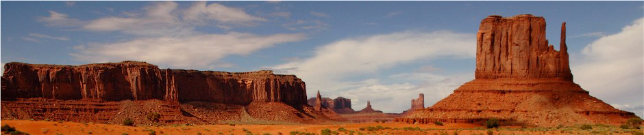
What about earth tones that are sparkling in the rising sun. The sky in this shot is calm and quiet. This Texas mountain is a fairly powerful subject and that sunrise light does add to the picture. The rocks range from gold to red. While the composition here is very ordinary as it was in the previous shot, those warm colors set me on fire. It’s a hot picture. This image originated on medium format film in the early 1990s.

——————————————————————————————————
Lewis Kemper recently posted an image from a bull riding event, entitled and I paraphrase….Have you ever worked on a picture so long, that you can’t even tell if it’s crummy or not? First of all, kudos to Lewis for his honesty, secondly, it makes me happy that I generally do very little editing. Recently Lewis has been showing a variety of pictures, where he has applied a series of edits, and then he courageously asks for opinions. I have not commented but the question I ask (in my mind) most, is why would you do these things when you make great pictures with your natural vision, using your eyes and your heart? The truth is, that it is perfectly natural and I think imperative, that we always explore what else we can “see”. I have found that photographers who have great natural vision, and who like to pay homage to the subject, usually return to the style that got them where they are.
Getting back to the original image that Lewis was commenting on. While we all have questions on our images, if he isn’t sure if his edit is crummy or not, it probably means it is…at least as far as he is concerned. I or anybody else, may see the art in the same finished picture. Art is something (my opinion) that should be made first for yourself. Of course when you make art your profession, you will without any doubt, have to make compromises about what you produce and what it looks like.
———————————————————————————————————
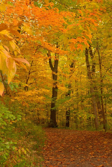
I have been sharing a lot of images of autumn roads lately. The only thing better than a road in fall is a trail through an auburn forest. There is nothing like putting your feet on the ground and immersing yourself in our greatest season. The silence is only broken by a falling acorn, or the scampering of a squirrel. Get out and experience it before it fades away.
Thank you very much, Wayne
