When photography was first invented, its described purpose was to
capture images of real life. In other words, the intent of the image
maker, was to show after the fact of making the photo, what something
or someone looked like. Reality second hand. It was not long before
photographers realized that we are all different, so then our pictures
should be different.
After that point, a personalized rendition from the image maker was
accepted, but photography was still about a subject and what it looked
like. This building or that building, this tree or that tree, this
person or that person. The point of view, time of day, or eventually
the change of a lens, was (and still is) what made a picture one that
came from this photographer or that one.
While the basic concept of photography remains the same into this 21st
Century, how we look at a subject, and how we look at the desired
result of a photograph, have changed.
Many if not most of the time when I have created photos, what the
subject was and what it looked like remained very important to me and
I would suggest to you as well.
When I went out with my cameras expressly to photograph Snowy Owls or
Red Foxes, my subject was centered in my brain.
When I set out to photograph flowers like say the White-fringed
Prairie Orchid, visions of that flower danced in my mind and my mind’s
eye, well before I arrived at the location where they resided.
When I stood at the top of the mountain in Rocky Mt. N.P. or in the
midst of sand dunes in White Sands New Mexico, it was those mountains
or those sand dunes that were what I was there to photograph.
With all that said, many, many years ago when I realized that shape
and form were also subjects no matter what or who it flattered, and
that color was a subject in and of itself, and when I realized that
the visual “feeling” of any subject is called texture and contrasts of
where light meets dark were subjects just as much as a flower or a
fox, I realized that I had matured as a photographer.
There have been very few photographic moments in the second half of my
life as a photographer, when I did not take notice of one or all of
the elements that comprise today’s post. In reality, almost every
image we make is dependant on some and often all of the concepts of
today’s post. One often flatters the other, and in many cases, one
does not exist without the other.
I am quite sure, if I was still making pictures today, those elements
and perhaps new ones would still be front and center.
Color and contrast go hand and hand. Soft, low contrast light can
provide photographers with vivid almost riotous colors in their
photos. Low contrast cloudy day light can allow colors to saturate
rather than wash out as they can do under sunny conditions.
As is evidenced by these two autumn images, as well as the photo
created in the Painted Desert of Arizona.


Low contrast light, can reveal subtle details and render a scene in
simple and gentle tones.
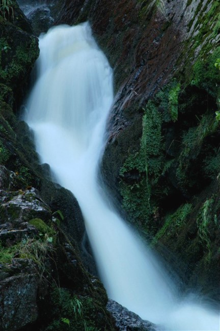
Subjects that are in fact gentle in their existence, such as a flower,
can have that gentleness featured if the light is low contrast and
revealing. In addition to the saturated colors provided by low
contrast light, this image has a lot to do with shape as well.
There is such a thing as medium contrast light or what I call “high
bright” conditions. The sun shines through enough to develop some
contrast, but it is muted just enough to “kill the razor sharpness” of
a cloudless day.

So high contrast light must be bad for things like flowers, right?
That depends among other things, on the direction of the light.
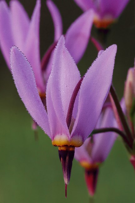
Backlight allowed me to carve a shape around this flower. The
inherent high contrasts of that kind of light also threw my background
into deep shade which I exploited with my composition.
This image is unquestionably about shape, color, contrast and via the
backlit spines on the stem and leaves, texture. Every aspect of
today’s post is evident here, and every aspect was exploited by me. I
did not say to myself, what about shape, color, contrast and texture,
I “saw” what nature provided me, and used it.

Silhouettes are the perfect and most obvious way of taking advantage of shape.
I, like many photographers, enjoy simple, obvious shapes when I make
silhouettes. Never pigeon hole yourself, because sometimes complex
forms, can actually be elegant and powerful as is the case with this
prairie tree at sunset.
This may be an image of the a tree, but it is just as much a picture
of shape and color.

This next picture is in fact a mini scene or landscape, putting
natural history on display. Imagine, at the very top of a blazing
white sand dune in the middle of the desert, there lives a living,
breathing bit of nature.
The composition here is important, but without the “psychological
contrast” that is provided between the lifeless sand and the living
plant, this image would be less than inspiring. Still, white sand,
green plant and shocking blue sky provide some interesting color
contrasts as well.

Mass confusion? That could go either way. In other words, maybe, maybe not.
This is an image of a gnarled old tree, on a very high contrast sunny
day, and is either hideous in its confusion, or beautiful within its
shape. Most photography is in the “eye of the beholder” so to speak.
Certainly shape, color, texture (moderately so) and contrast all play
a vital roll in the success or failure of this image.

Contrasts are part of photography but as I have said, there are many
sorts of contrasts. The contrast of light and dark light, or that of
light and dark tones are the most obvious, but what about color
contrasts such as warm and cool colors contrasting against each other?
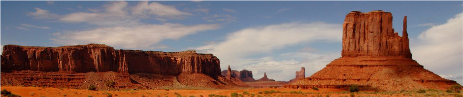
Warm rock and cool blue sky contrast with each other in two ways. Rock
as we all know is hard, and sky is certainly soft. So the sky is soft
and often is the cool color of blue, and rock we know is hard and in
the case below is the warm color of gold.
Double contrasts, double benefits.

The same principles apply with this land arch in Utah but notice we
also have a huge shadow which creates a contrast with the sunny areas.
Color contrasts, light contrasts, and the benefit of sidelight which
creates thousands of tiny shadows (due to contrast) within the
crevices of the rock. That not only provides more contrast but it also
produces the visual effect of texture.

Most of those same principals apply with this shot from the Badlands.

The bonus of working in early or late light is, the shapes (and
textures) are more defined from low angled sidelight, the color is
richer from the warm sunrise/sunset, so the shadows and therefore the
contrasts are more compelling whether used judiciously or
dramatically.

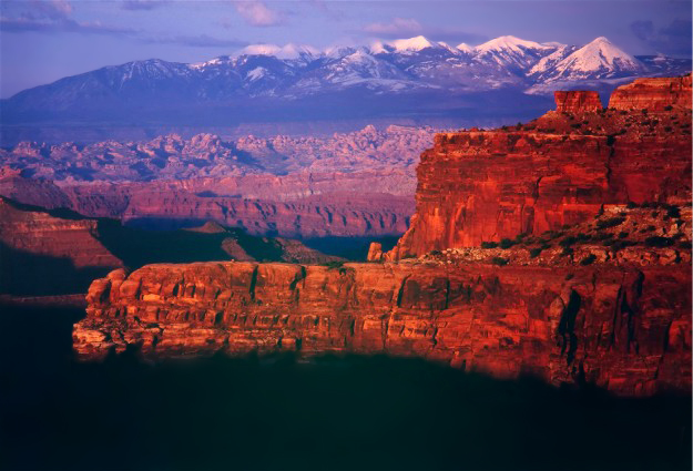
When the light gets really low, the colors intensify beyond our simple
imaginations. There was not a lot of light left when I created this
image in Utah. Form, contrast of both light and color, a nd the light,
and color itself are major components in this photo, and despite the
fact that our subject is far away from us, the low angled light still
produces texture.
Late, steeply angled light, can create elements of contrast even when
they do not produce total shadows. This picture of a Colorado canyon
at sunset, is rich in everything but color contrasts. That may make
the image a bit less spectacular than the last one, but it is none the
less powerful in its charm. It also does a good job of providing
natural history information about the location.

What about when you remove all evidence of color from a scene? Well,
as colorless as a transfer to black and white may render the subject,
this picture is as dramatic as any I have shown you today.
Deep sidelight, produced shadows that have created both mystery as
well as undeniable texture in this scene from the Badlands. This
colorless rendition has actually made the sky more fascinating than if
I would have chosen the “normal” route of color. Composition, the
personal tool of every photographer, has (I believe) added drama here
as well.

This scene from White Sands New Mexico is naturally low on color, but
high on shape and form. The blue sky was not very bright when I made
this. The low angled sun however, produced shadows behind every furrow
of sand. Most of the texture I have showed you on this post, was
miniature in nature. It created the sort of texture you can almost
feel on your fingers when you look at the picture. These shadows
however, divide a larger area of the subject. You could put your hand
into many of these valleys.
Effective, none the less.

The colors here (southwestern Colorado) are saturated due to the semi
overcast, high bright conditions. There are only minor contrasts
between light and dark, but also there are color contrasts. There are
however, also subject contrasts.
At the bottom there is a vibrant sliver of green grass that could be
seen as likely in Florida as in Colorado. The golden colors of the
desert land formation penetrate our senses in the next layer, which
could take place in the low or high deserts on Arizona, Utah or New
Mexico. There is texture in this part as well. Then come the high snow
capped peaks that you would expect in Colorado or maybe Wyoming or
Montana. It is all set off with the “semi” colorful soft and gentle
skies looking down on it all. Three, maybe four scenes in one. Shape,
color, texture and contrast.

I first embraced digital photography round about 17 years ago. The old
film photographer in me has always remained alive within the digital
photographer. I love the discipline to create a finished photo at the
moment you click the shutter. Regardless of that fact, I like all
digital photographers, do at least some editing to my files. Today’s
subject of shape, color, texture and contrast, can be enhanced in the
digital darkroom.
Virtually every photographer who edits their images at all, will work
at least a little with the contrast of an image. Most will increase
rather than decrease the level of contrast within any given image.
Doing that will obviously increase the differences between the light
and dark areas of a picture. Like most edit tools, a little can be
good, a lot can be silly. Do everything you can to capture the truth
of contrast when you are making the picture, and then add (or
subtract) levels of contrast, to “finish” off the photo. To put the
final touch that makes it say what you believe the scene was saying to
you in the first place.
Many of today’s images contain bright values and deep shadows. There
are a few that still maintain some small detail in the shadows. That
is how I saw it when I snapped the shutter. I could easily add more
contrast while editing the images. That would add even more drama, but
I chose to display them the way I saw them at the time of snapping the
shutter. That is a personal choice made more by the old film
photographer than the digital photographer.
Texture can be enhanced while in the digital darkroom as well. It can
be enhanced or made to look dumb, either way, by adding sharpening to
the area where texture is desired. I do not suggest this because by
using low angled sidelight while making the picture in the field, you
will reproduce the natural and powerful texture that nature supplied
in the first place.
I never use the saturation button. I have tried it, but at least with
my software programs, it is atrocious.
Photography is a tough business (I can testify to that) but it is an
incredible way to express yourself. It is up to you to find the
elements that add up to a finished photograph. You find them only
because you can “see” them. You assemble them in your mind and
organize them with your camera and lenses because of your expertise in
photography, and sometimes you create art, because there is an artist
living inside of all of us.
God Bless,
Wayne
