Let’s do just one more (until the next time) of those mix and match, a little bit of everything photography posts. Next post up, will be photography-less so to speak, as the desire to immerse myself in another subject is gnawing at me.
Black and white conversions.
Digital photography, brought us a whole new world of black & white aficionados. A simple click of the mouse (sometimes a selection on your camera), has made shooting black & white instead of, or in a addition to color, a very easy choice. Creating an image in both color and black & white, and doing so with one click of the shutter, has given all photographers, the opportunity to be “ambidextrous” so to speak. In the days of film photography I actually would at times shoot color negative images, and make prints on Kodak Panalure black & white (if memory serves) paper and create monochrome images from color originals. I’ll take digital every day for making the switch.
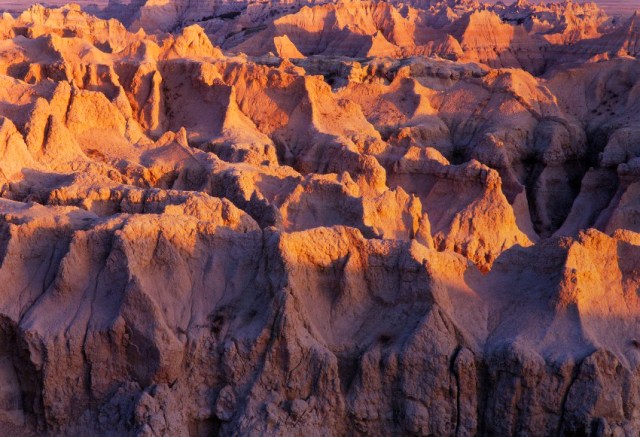
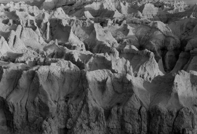
Today’s first five images initially show a color original, followed by my black & white copy. I did zero editing work on the black & whites.
This first picture was made in the Badlands of South Dakota and in my opinion, they both work just fine.
Rock almost always works well in both disciplines as you reduce that subject to light and shadows, and textures. Shadows help delineate the depth of the image and textures. Those factors are really what rock is mostly about. There is a third factor and that is color. In this case it is very difficult for me to ignore the colors of sunset and how it casts a “flavor” on the rock. The black & white works best for me when I do not have the color image to compare it to.
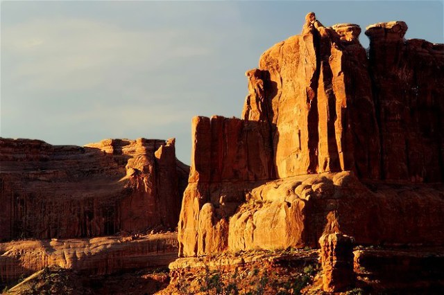
This next image, as is true with the previous, actually originated on film. It was copied into the digital format several years ago.
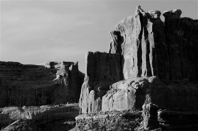
We deal with many of the same issues here. This is the Office area of Arches N. P. in Utah. Here I caught some high contrast light in the latter part of the day, and once again shadows are a big part of the picture. Once again I like the color shot, but in this case the two images are a 50/50 toss up for me. I love the Navajo Sandstone and the light in color, but reducing it to monochromatic tones, brings is to the bare essence of the rock and the light. 50/50 for me.
This next one is a digital original and was created very high up in Rocky Mt. N. P. in Colorado. I find that the large splash of green in the color image helps light up the scene. It gives it a unique ‘flavor”. I like the contrast that is created by the low, shadowy values on the hillside below the peaks. That being said, I love the contrasting values in the black & white even more. This image has a surprising energy (to me). It seems in some ways to mimic the old masters of black & white with no credit for that belonging to me.


The Maroon Bells of Colorado are beautiful no matter what you do to them, but this image is bare basics due to the absence of Maroon Lake and those legendary reflections. The alpenglow on those peaks in this image becomes how you define them. Take the first picture away and then the black & white, works almost as well. In any case, taking the lake out of images of those mountains in any form is a kind of blasphemy.


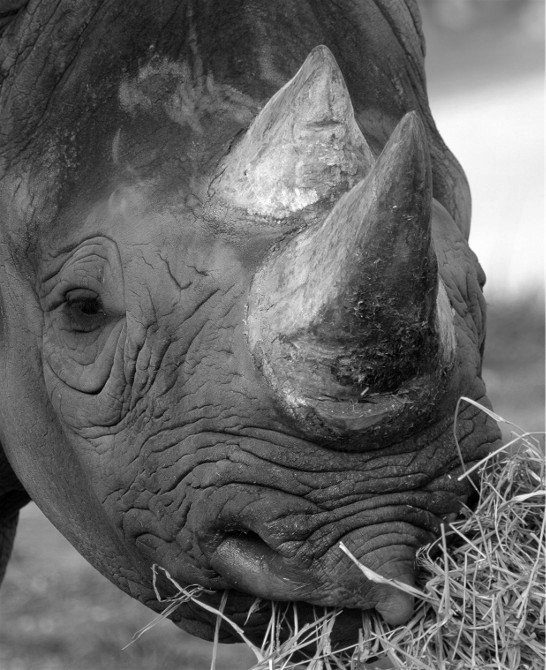
Who makes black & white images of wildlife? I mean come on!!! Well, sometimes I do.
African White Rhinos are almost gray, or you might say black and white. Still, there are warm tones here and there, and that hay, (a captive animal) is decidedly warm. If we only saw the black & white image, we may not even realize that this is in fact, a black & white image. The picture works fine either way, as it is such a close-up, that the subject of the image, is mainly skin texture. It shows well either way.

Let’s switch gears and keep things mixed up.
Wilson’s Arch in Utah is probably the most seen arch in the American west. That’s only because its sits next to a (two lane) state highway. Anybody can stop, and wander around as they choose. It is by no means the most beautiful arch but it is nice to stop and photograph and arch that does not require a hike and/or a climb.
This first picture is a digital original and was created in 2006. It is a rather uninspired image, and is not even my best made of Wilson on that trip. Just the same, I know that some people like it.
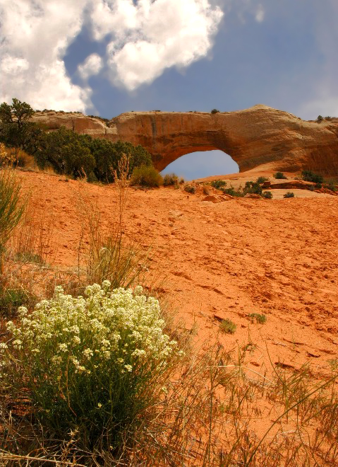
This second picture is a film original made in 1992. It was just after sunrise, and I was traveling past and became fascinated with effect the reddish morning sun had on the opening in the arch. The opening, and the color or glow, became my subject. I prefer the second picture despite the lack of visual information that it displays. Abstractions, can at times, be far more rewarding and fun to create that straight up imagery.

I am not sure why I included this image made along the Arkansas River in Colorado in 2007. I have shared most of the images that I made at this location many times previous to this. The main difference in this particular shot is that it was made when a large cloud came over, throwing most of the subject into shadow. You can just see a little brightening in the far left of the photo. As much as I love what the sun can do to the land for an image, almost every photographer I know, underestimates the color saturation and other benefits derived from cloudy day scapes. I made a careful exposure for this picture, but I also made sure to keep it toned down when I edited it in Photoshop. While I evaluated the scene, I took multiple spot meter readings from (I believe) three separate areas of the scene. Ultimately, my exposure was 1/400th sec. (that’s right landscape shutter speeds can become high) at f8 with a lens set at 70mm.

Anytime I was out working a scene, I attempted to “look at” my subject in varied ways, and I generally made a variety of compositions and/or exposures.
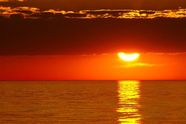
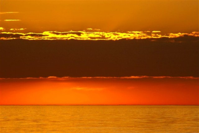
This is a Lake Michigan sunrise made not too far from home. The images were made on June of 2008, and the first two are seven images apart, both done with a 300mm lens. In that time, the rising sun lifted into the cloud bank, and that made for two very different moods. All without changing my physical position in relation to my subject. After the sun dipped behind the clouds (second picture), I left my f stop at 14, but slowed my shutter speed (more light needed now) down from 1/200th sec. to 1/125th sec.. The final image was made only two frames after that second picture. As the sun rose above the clouds, it was still colorful and pretty, but the “big picture” was getting dull, or maybe just dull for me. I love silhouettes and I have used this craggy old fallen tree, many times. I zoomed out (or in) my focal to 170mm, but strangely enough, kept my exposure at f/14. Even though the light (backlight) was getting more intense, I took my reading from the brightest area just off camera left, which left me with an absolute silhouette of the log, it’s shadow, and the small amount of river bank that shows at the top. You can always add contrast in the editing process if you wish.
Silhouettes are clean and simple art.

We are in the heart of winter now, so I will share with you three (original film) images of spring (of course). They were made many years ago in one of America’s best spring photography locations, The Smoky Mts. of Tennessee and North Carolina. As is always the case when you “work an area”, variety is rewarded. I am guessing these images are from the late 90s, or very early 2000s.


I appreciate your letting me “mix it up” while talking about photography.
Have a great day,
Wayne
