Once again we revisit the idea of clean and simple images. You might say that less is truly more. This philosophy proves to be true with most subjects, but throughout this series I have been dealing primarily with bird photos.
My experience tells me that those clean and simple images are popular with magazine/book editors, buyers of art, and the general viewing public. My opinion also is that we still need to share imagery that includes habitat. Photography is both art and education. What about those “busy” pictures that show habitat, but are just to confusing to the eye? Those that include no real meaningful information? I try to keep those pictures buried in my files, but I really don’t have to do that anymore. Starting a few years ago, for the first time since 1971 I have nothing for sale.
These Bald Eagle images have been sitting in my files getting rusty since February of 2008. They may not be sellable but they really shouldn’t be deleted. I have a million like that. We probably all do. Why did I bother to make these images? Can you sit and watch Bald Eagles sitting in front of you and not click the shutter? If you can you are better than I ever was.
Those trees that hold the eagles reside right next to the dam on the Wisconsin side of the Mississippi River near Dubuque, Iowa. There is an old barge that sits frozen in “Old Muddy” that photogs can shoot from, and it stirs memories as I write this.

Sometimes it is all about people’s fondness for the subject. I had a great time on a cold winter’s day several years ago working with this cute little Black-capped Chickadee. While I enjoyed what I was doing, I never really made plans to show any of the images that I made. It was a busy, cluttered scene and it had tone contrasts with the white areas of the background. It was however a cute picture of the bird, and Chickadees are a favorite of anyone in this part of the world who feeds birds. I placed it on my website entitled “Cold Feet, Warm Heart” and it turned out that nobody cared about anything but the cute little bird. I had mixed feelings because this is not an image I envisioned hanging on people’s walls, but I shut up and did my job. I do admit that I shipped without my signature. 
There were two issues with this series of images of a Common Moorhen. Firstly there was a busy background, although it does fit into that “showing the habitat” category. That habitat would look better in overcast light. The second problem was that I was shooting through constantly blowing foliage. The sunshine made those grasses fairly obvious. They produce a hazy low contrast image. The solution, or at least the I only one I was going to use, was to add contrast. That added crispness to an area that was blurry, although there is still some “sunburn” in the lower right of the picture frame.
These pictures also fit my recent theme of sticking with your subject and capturing as many poses as possible. This Moorhen however was an animated and interesting subject. It was providing me with decidedly different poses not just subtle differences.


Excessive contrast as well as tilting and converging lines are subjects that photographers have been doing combat with since the beginning of photography. Those lines can be controlled by using cameras with bellows, or with tilt and shift lenses made for 35mm and digital cameras. Using Galen Rowell’s color zone system or just playing with Lightroom or whatever software program you use can to help cull the effects of contrast. The question is do you really want to always” do that? There’s a time to interpret and explore. This old Door County, Wisconsin lighthouse was boring to me until I really looked at it from a new angle.
I enjoy photographing architecture and way back when I was doing that kind of work commercially, I would have had to either by technique or bellows, correct the tilting lines in the photo above. Sometimes looking for the art in a building is a lot more fun.
Speaking of old Door County lighthouses. What a great old building.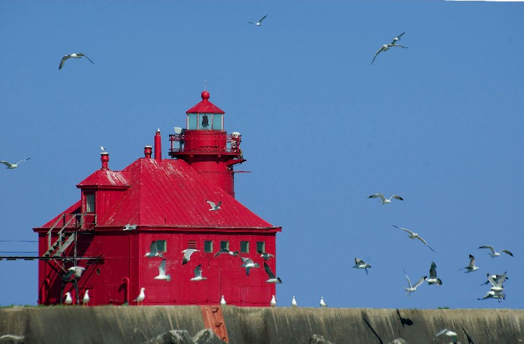
The softly blurred water that you see in most waterfall scenes is not reality. In most cases 1/60th sec shutter speeds with “average” falls of “average” volume and speed approximate what we see with our eyes. Most photographers, including myself, often go to great lengths to lose enough light through the use of filters and stopping our lenses down to f32 so we can create this effect with the resulting slow shutter speeds. I do try to use faster, water stopping shutter speeds with large, powerful falls, but I would hate lose that cotton candy effect on small or inner forest waterfalls. As photographers, when we collectively decide that a special effect is okay, it will soon become the norm for viewers. I will admit that does sometimes worry me when I look at all the altered landscapes being produced..
We all have a story to tell. A legacy to share. We can tell our story with pictures or words or by how we live or by who we have touched. This blog and its over 500 posts has been one of many ways I have chosen to share my story. Who I was and who I am. Whether words or pictures or something else holds the truth about you, find a way to get it out. We learn from each other and every story has a beneficiary.
God Bless, Wayne
