I have shared illustrated articles on black and white before, but this if the first time that I’ve matched image to image, color to black and white.
I often miss my early days of photography with black and white film, and my black & white darkroom. I shot both color and black and white from the outset, but I never considered my images to be interchangeable, even though I could, and did out of necessity, print some color negatives in black and white. Just the same, from that initial glimmer of light in my imagination, to the finished image, they were either black and white or color.
Digital imagery changed that, and I am glad it did. I do think old timers like myself had an advantage over new photographers who were of the digital era. We knew how to “see” in black and white. Now days, whether they shoot color and later decide to convert, or pre-visualize black and white from the onset, most photographers get it. Color photography has of course color, but also contrast and tones. Black and white is a world made up of tones and contrast. With the flip of a switch (well, click of a mouse) , we can convert colors to tones only. It is one more artistic weapon in the photographic arsenal, and it is a good one.
All but one of the images below were shot in the digital format as color photos. Only the very last picture of a foot bridge, was meant to be converted to black and white already when I was pressing the shutter button.
It is true that when I traveled to any western rock park, the thought of future black white images occurred to me, but my original composition and use of light, was always meant to flatter my images in color.
The only black and white conversion editing I did on these images was to adjust contrast. Contrast is always important but with black and white, it is the essence of the image.
Almost all of the pictures of any sort that I have shared with you on this blog, that belong to me, have had zero filter applications added. There is some amazing software out there but my own images are absent of all of those things unless I tell you. I work in the editing process a lot with contrast, and a little with overall exposure, but I am a lover of showing you, what I saw with my eyes, and in my mind, when I clicked the shutter. That includes abstractions.
I give my opinions on black and white verses color, below the images.
Badlands and storm.
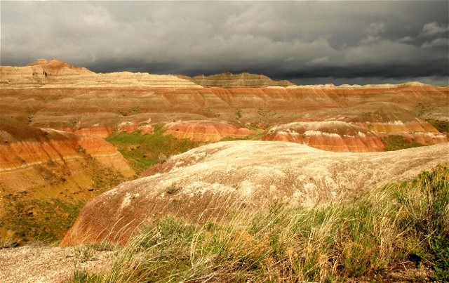
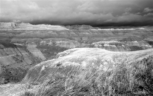
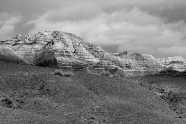
I think the Badlands (especially with storm) works well in either color or black and white. My preference is however, the color shots. I cannot see not sharing the intense, saturated colors that occurred during the overcast light conditions.
The color of light in these Black Canyon of The Gunnison pictures was very important. Is the black and white translation, interesting enough to stand?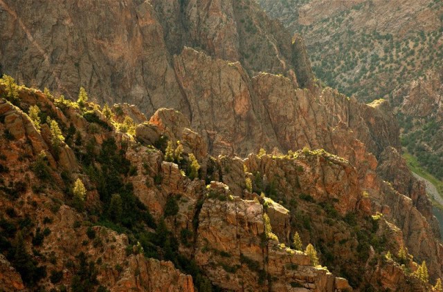
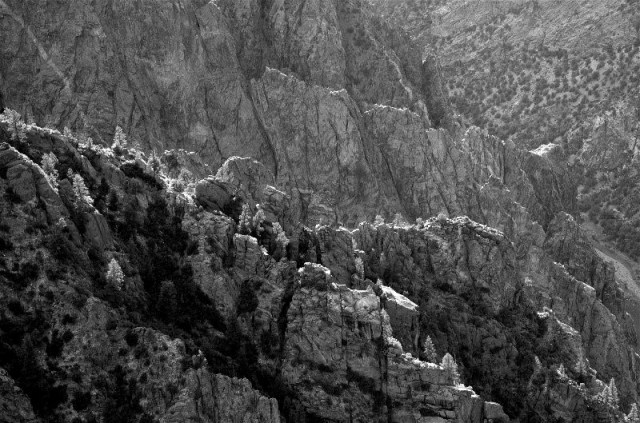
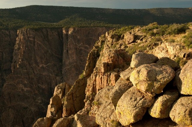
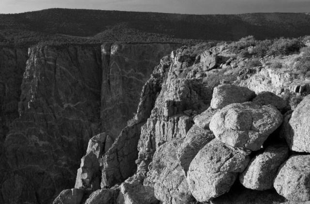
I am ambivalent about the top image. I think it works equally well in color or black and white. I like the bottom picture better in monochrome. I think the color gets in the way of the dramatic light.
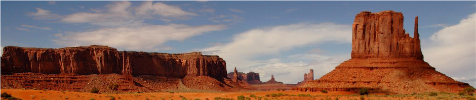
This rock, sky and cloud picture, was made in Monument Valley and I will admit, it was the (color) contrast between those subjects that drew me to create the picture.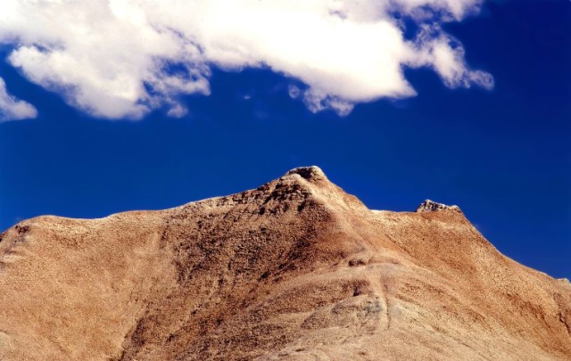
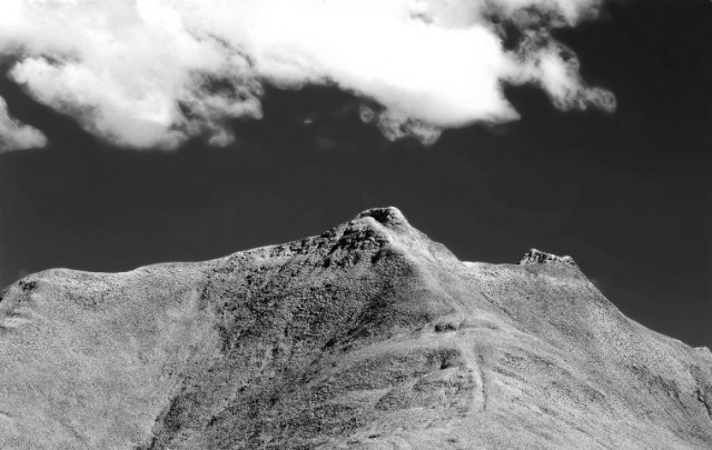
This one was close for me but I like the black and white better. The color contrast that I pursued when I made the original is strong in the color shot, but I like the dramatic contrast between light and dark in the black and white picture even more.
Are the black and white versions of the high color pictures below an acceptable alternative to you? If not, would they have seemed a good and artistic choice if you did not have the color version in front of you? Sometimes it helps to see only in black and white, but it is an interesting exercise to see both together. The Foxtail Barley Grass, and the Phlox photo, were about composing color just as much as shape and texture when I made them.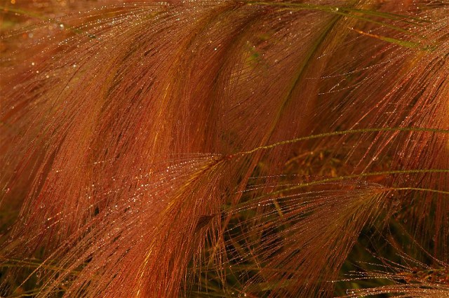
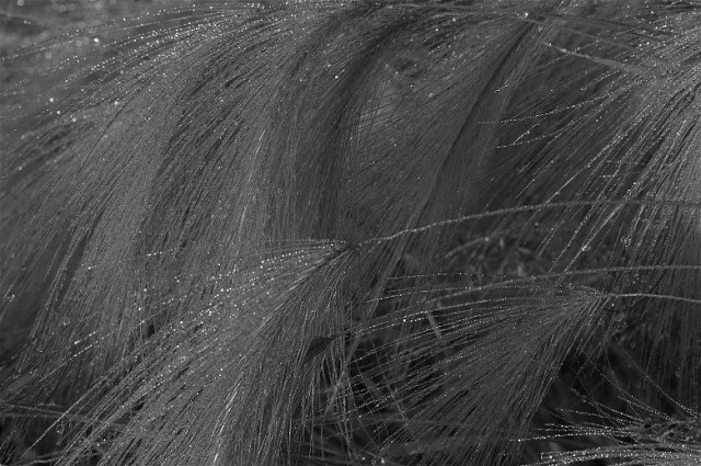
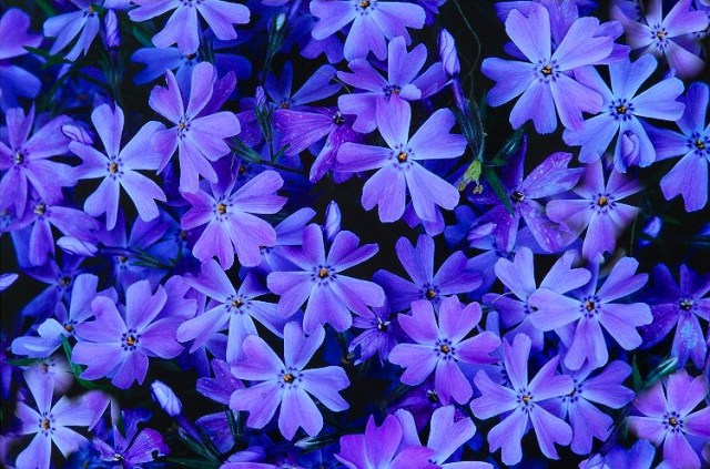
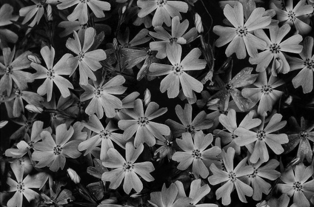
The top picture of Barley Grass is an easy one for me. The image may be about the lines and textures of the grass, and about the dew, but mostly it’s about the rusty color of the grass in morning light. I MUCH prefer the color shot. In the photos of Phlox, it is a much closer call for me. I do like the subdued black and white image of flowers. It takes us away from the color and creates a feeling of nature’s patterns and their inherent beauty. Still, that electric blue is spectacular and I will choose the color shot.
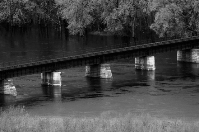
This old railroad bridge over the Mississippi River is actually an old film shot. I can assure you I never thought of black and white when I made it.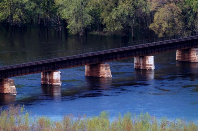
I like both versions equally. I love the soft muted early spring colors but I love the soft, ethereal black and white just as much. I guess sometimes choosing a favorite picture is like choosing a favorite child, you just have to decide to keep both of them.
I have never heard anyone ask if I would show them the original color version of this old (now gone) footbridge. Every twist, and every inch of texture, screams black and white in this one. I do think that having been a black and white photographer helped scenes like this to jump out at me when I was out making pictures. On some occasions, they just beg for a back and white treatment.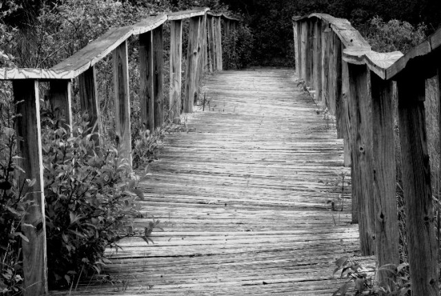
I did not show you the color version because it is just another picture. There is nothing remotely special about it. This picture “only” lives in black and white, on my digital hard drives.
Whether you see the world in color, or black and white, it’s okay to share your vision. I have pretty much always seen both a colorful and a monochromatic world. I love seeing one scene or subject, in a variety of different ways.
God Bless, Wayne

Nice to see these comparisons and figure out which speaks to us the most. Funny enough I believe I’ve got that same footbridge shot in early fall showing some trees in the background. Hadn’t thought of it in black and white since I liked the touch of light and color into the background but now I can’t wait to now do a black and white conversion and see what I think of it that way.
Cindy
Hi Cindy it’s great to hear from you again.
I think if I had not seen that bridge that way in my mind at the time of making the picture, I would have loved the color version. Sometime black & white occurs to me when I create the shot, but mostly it is after (sometimes a long time after) the clicking of the shutter.
I could never be a full time black & white photographer like a John Sexton, but it is nice to get the color out of the way once in a while and just concentrate on tones.
Keep up the good work,
Wayne