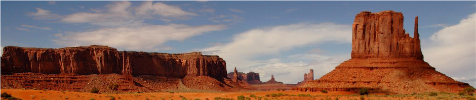
Color Void
I do enjoy the art of black & white image making. Not long after I began serious photography, many, many years ago, I put together a black and white darkroom and have been an enthusiast ever since. Black and white teaches us to forget color and think about tone. Understanding tone is a valuable lesson, and is or should be, used in color photography as well. In the 1970s, I learned Ansell Adam’s zone system and for the first time began to see the slight (one zone at a time) differences in all photographs whether they be b & w or color.
Black and white photography is often looked at as old-fashioned because our first photographic images were in black and white. The truth is, that most young photographers today have grown up in a primarily color oriented world of photography. Black & white usually means “only art” to them. We of course see in color, which makes b & w an abstraction of reality.
Which subjects work well in black & white are a matter of opinion, but I have always enjoyed things like rock or sand when they are displayed in tones and are void of color. The problem becomes that when you see in color like all of us do, and you are primarily a color image maker, as most of us have been for a long, long time, it is difficult to disregard all of the incredible colors that are created through the use of colorful light on that very same land (rock & sand, etc.). Sometimes it takes courage to turn a colorful image into black & white.
The first four images below were pretty colorful in their birth. In fact the final of the four was made at sunset and was dripping in color.


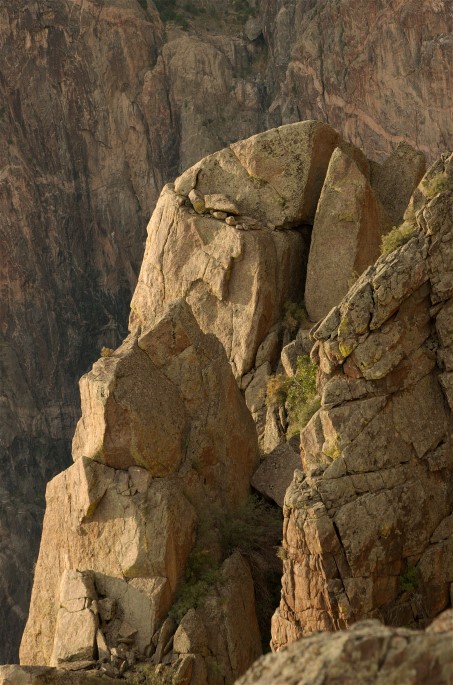
In the next three images we have both the black & white and the color versions. In the first two I have given you the b & w picture first and then the somewhat jarring color version. You get settled in with the b & w and then comes the color. Notice that these very straight forward conversions have the exact same tonal ranges as the color versions. Normally when I convert, I work with contrast, but I chose to leave it as it is in these pictures..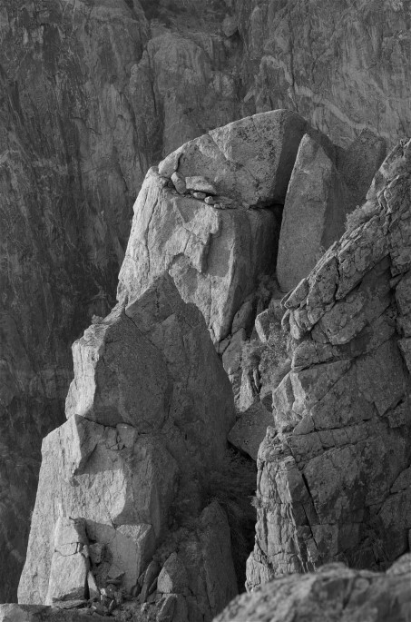


For this rock and tree picture, I (obviously) reversed the process showing you the color first. Is it more difficult to accept the b & w version when you have already seen the color shot? 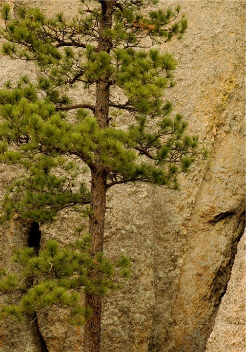

Most of my digital black & whites, were conceived to be black & white from the moment I saw the subject. That always works the best for photographers who have experience with black & white. I cannot speak for the rest. All that having been said, it is a legitimate option to convert your color pix to b & w, at any point in the future.
Black & white isn’t for everybody but I believe, the more options the better. Black & white offers you an alternative way of expressing yourself. It is done without making actual changes in the subject in terms of adding or subtracting from the scene, except of course, for color.
HDR
HDR imaging is criticized by many, including me. It is overused and often presents the viewer with untrue colors and a scene that barely resembles reality. It does however have a valid purpose for anyone who makes pictures.
The craggy old tree you see below fascinated me greatly, but the midday contrast levels, especially with a subject that was mixed in sun and shade, made for exposure decisions that forced me to underexpose the shade portions of the tree and scene, in an effort to keep my highlights from blowing out. This was before I knew about HDR photography, otherwise I would have made three varied exposures and combined them to control that contrast. Now mind you, I love the drama of shadows, but I wanted viewable detail in the whole tree. The answer? At home, I took my original image after conversion to jpg, and produced one slightly underexposed copy, and a substantially overexposed version, and then layered them one on top of the other with HDR software. If you compare the two images you will see there is more detail in the shadows of the second (HDR image), while the highlights are kept at a very manageable level. The saturation increase in colors that you see, is from that same layering, but is truly what my eyes, with their ability to adjust, saw on that day in Colorado. HDR can be a cartoon or a very useable tool, that’s up to us.

Autumn in the mountains
This final image is shared today because in the high country of the American west (Wyoming in this shot), those Aspens and other species are beginning to change. This “somewhat” straightforward interpretation was made in the Jim Bridger Wilderness. My vision with this image, was in the act of layering, or sandwiching, the outrageous colors of the soft and frilly leaves, with the stark white and rigid design of those tree trunks. Every image we make, should be a design of sorts, whether the photo is traditional, a full abstract, or something in between like this.
That layering or sandwiching effect started after some landscape photographers began creating their images with first medium format, and then 35mm film cameras. A 4×5-8×10 view camera, requires large awkward lenses for telephoto compression, and the whole rig is generally supported by two tripods, one under the camera, and one under the lens. Smaller cameras with long lenses require only a single tripod under the lens. The visual compression that can be achieved with telephoto landscapes, is just as important of a compositional tool as is the wide-angle lens which we use to stretch a scene out.
——————————————————————————————————-
The beat goes on.
I learned only recently that my long time race photographer friend Al Graf died way back in 2012. To many, Al seemed like a gruff, crude sort of guy, but he was all melted butter inside. At well over 300 pounds for much of the time we shot pictures together, Al was the gentle giant of auto racing photography. He had many health problems and carried a kidney borrowed from his father. It’s funny, but I never thought about what I learned from him until I found out he had died. He was younger than I and began his photography after I did. He actually taught me much about how to remain tough, without becoming jaded or cold. He and John Kozy (also gone now) were my first two racing photographer friends to accept my nature photography, and would often ask questions about this or that.
My years in auto racing photography brought me many good friends as we dodged 150 mph race cars and swapped stories (lies?) about our exploits. We competed against each other to get our images published, to acquire press credentials and at times to sell prints. There was never a one of them who wouldn’t give their arms and legs to help you if you needed it. So many are dead now that I don’t want to wonder about if this one, or that one, is still around, but to Al, John, Mike, Jim, Armin and the rest of you who have left us, thanks for accepting me as one of you.

I’ve met people along the path of nature photography as well, who were very special. I would be a much poorer person if I did not realize how much they gave to me. Most of you are still around and I hope I gave you a little something back in return.
We cross paths and share ourselves with a lot of people in our lives. Often after a time, they don’t seem to be who we thought they were. Other times it seems like they change and it’s difficult to accept those changes. Whether they (or we) remain as our original conception, or they ( or we) evolve into something else, we need to recognize that we’ve taken something of value from every single one of them, and pray that we have left something of value behind.
God Bless, Wayne
