Please allow all of the images below to slowly clear themselves after they download.
Clean and simple=powerful in photography. Less is more. Compositionally this image is one of leading lines and simple graphics.
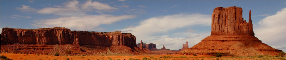
The environment in which I made this picture was a lot more confusing than the sand dune photo. Still there was an ordered picture to be found. It took not settling for the first (or 2nd, 3rd, etc.) composition that I found.
Sometimes there isn’t much you can do to change the confusion of a scene. If the subject is worth the shot, then I make it anyway. I did move my car (blind) about ten feet to get the hawk out from behind some branches.
There are of course different opinions on all aspects of photography. This stark, monochromatic (it is not a b&w) image appears (to me) both cold and inviting at the same time.
The Color of light. Please excuse the fact that both of the next two images have been on this blog fairly recently. They illustrate my point so I have returned them to service one more time.
The appearance of both of the below images are as natural as nature itself. One of the first and most important skills (in my opinion) a photographer needs to develop is the ability to see the light and interpret how it will affect the subjects we encounter in nature. Not one single click of the saturation button has been used with either picture. I have not used the Photoshop color balance feature with either image either. I have been studying light and how it paints a variety of subjects for almost forty years. It is true that there are photographers who have made that saturation button their best friend. There are many photographers who use HDR photography only as a means to create layers of color. There is however another extreme in nature photography. There are those out there who seem to hate eye-popping colors so much that they would have de-saturated the colors or flattened out the contrast with those images below to the point that the colors were impotent. I suppose it is unlikely that they would have made the pictures below as I suspect they might not have seen how the color of light altered the appearance of those subjects in the first place. In other words, at least the feather would have been just an old feather.
We are all different and everyone has a right to see light and nature in their own way. Just the same when people criticise photographers like me because I do see the color of light, and want to celebrate the glory of nature with my photography, then I will use this forum to fire back.
I am (like many of you) the photographer who has been out photographing every kind of light nature provides. The vivid and the not so spectacular. Every time of day and year. Clear skies, cloudy skies and everything in between. I have photographed as many “little brown birds”, gray birds and immature birds as I do colorful birds. I celebrate everything in nature.
Much of the time it is not even about seeing the color of light. It is just a matter of recognizing lighting conditions that make colors pop. Natural phenomenon that is given to us as a gift. In my New Pix Again post you will see a Red-bellied Woodpecker image. This and other birds were working their way up a wooden post towards a hanging suet bag. After a few shots with this particular bird I realized there was a chance to photograph him in the sun, but with a shadowy background. This is a royal opportunity to make his beautiful colors pop as he becomes separated from the background. I use this technique with flowers all of the time. This is the very reason that so many photographers show their images on a black background. Nature provides us with a natural way of doing this. It is our job to recognise it and exploit it. There are photographers who will insist that it is a phony technique. It is natural and it is a gift.
The feather in morning light is also a gift. I recognized the opportunity. The very first rays of light painted this white feather. When you add red or gold to white what do you get? You get pink or salmon color. It certainly did not take a craftsman to make the picture. No compositional brilliance was needed. My goal was to expose the picture so that it would show that beautiful color, and to use the direction of the light to display the wonderful texture within the fibers of the feather.
The picture of the Utah arch was made in very similar light as the Wisconsin feather. Maybe a little later but not much. The natural color of this sandstone arch is warm. The addition of the warm light of early morning enhanced that fact. Naturally. The blue sky added to the eye-popping colors. The warm colored arch advances while the cool blue sky recedes. They visually separate and become even more saturated in their appearance. Perfectly natural. The deep shadows make the visual even more eye-popping for the very reasons I discussed above. Again there was no compositional art needed for this picture. In this case the subject and the light carry the image. I just recorded it.
One of my jobs as a nature photographer is to recognize light and color, and to share that with others. It is not a matter of taste. It is not like dressing myself. It’s not a matter of selecting dignified colors so I am in good taste. It is a matter of seeing what is there and being able to record (artistically when possible) it and show it. All of it.


With photography, there are equal parts technology, craftsmanship and art. Certainly art is a matter of opinion. The technology is important but this aspect of photography can be bought with a credit card. It has nothing to do with skill. Craftmanship is to be admired but in my opinion is different from art. Art takes a little courage. Artists take chances with their images and then put them out for the world to judge. Craftsman make great pictures but pretty much make the same images over and over again. An artist will challenge the way you look at any given subject. An artist will of course win some and lose some. We need craftsman and artists in every walk of life. At least that is my opinion.
Thank you and enjoy.
